|
|
|
|
---------------------------------------------------------------------------------------------------------------------------------------------------------------
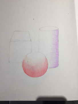
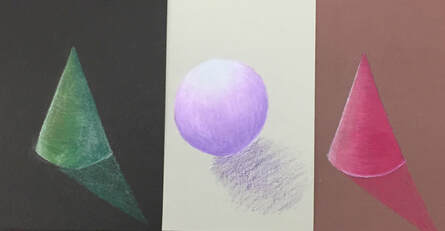
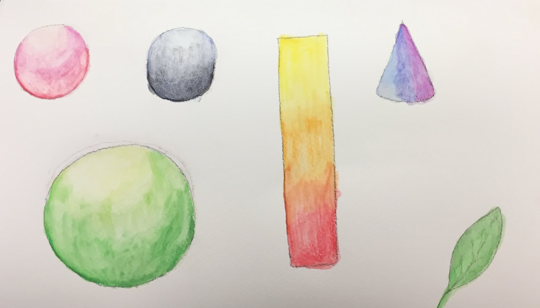
Shapes-
Shapes-
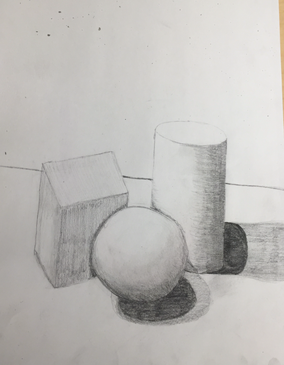
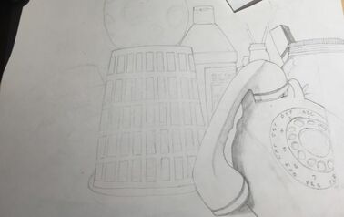
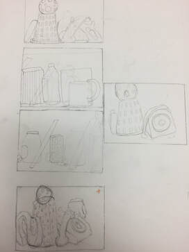
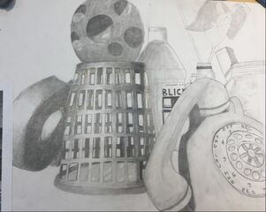
Still life progress pictures- |
|
Still life final and questions- |
|
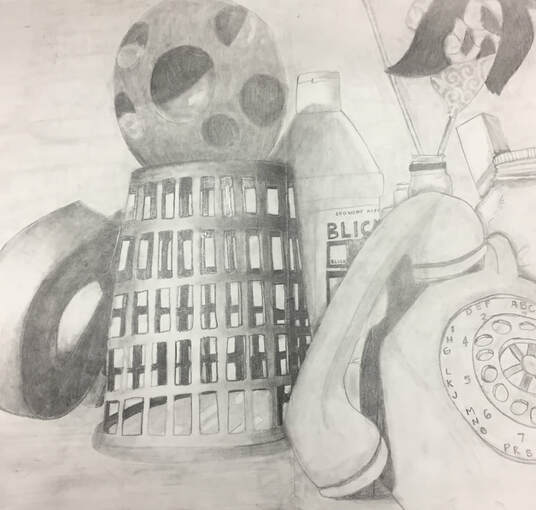
1. Describe how you arranged your composition? Discuss your use of the elements and principles. Is it a successful composition?
I wanted to get a bit of everything in my drawing to challenge myself. Each of the elements in the picture needed a lot of shading and highlighting so tried my best to draw the exact shadows and shines that were in the picture I printed out. To me, I think this isn't a successful composition as I didn't draw everything in the right perspectives.
2. Did you use a wide range of values? (A range from white to black with at least 9 values). Explain how this is evident?
I used a bit of a range of values. For the basket, I had to do a lot of shading and highlighting, as well as the the letter "s".
3. Explain how you knowledge and creating practice studies with value contributed to your piece.
Practicing shading and going from light to dark helped me a lot when drawing the basket because it was sort of a gradient from light to dark.
4. Describe the blending and transitions in your objects (discuss your use of pressure with pencil and other techniques to achieve this).
In my piece there was a lot of blending involved, so I had to get used to pressing lighter and harder in certain parts.
5. Explain how your interpretation of texture is essential in capturing the look of the object.
Most of the time you can't figure out what an object is without the correct textures, and adding textures makes an object 100x more realistic than without it.
6. If you could recreate your pieces what would you do differently to enhance the final outcome?
I would try to be more exact with the shading and the placements of each object.
---------------------------------------------------------------------------------------------------------------------------------------------------------------
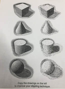
Pen and Ink unit-
|
|
|
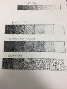
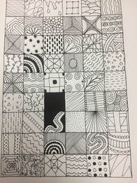
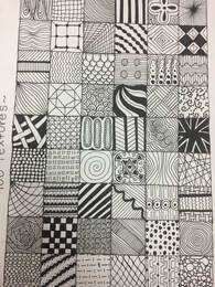
100 textures-
|
|
- I came up with 100 different patterns with different values.
Landscape-
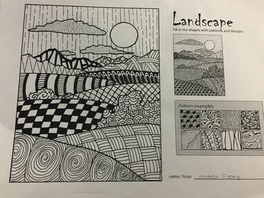
We had to fill in the landscape picture with the patterns and designs we made in the 100 textures project.
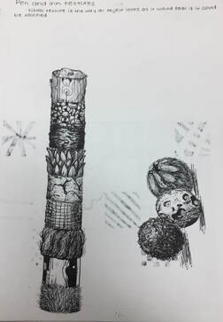
Pen and ink 4 practice forms-
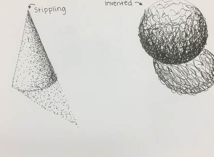
|
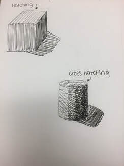
|
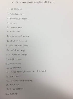
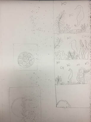
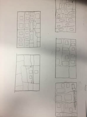
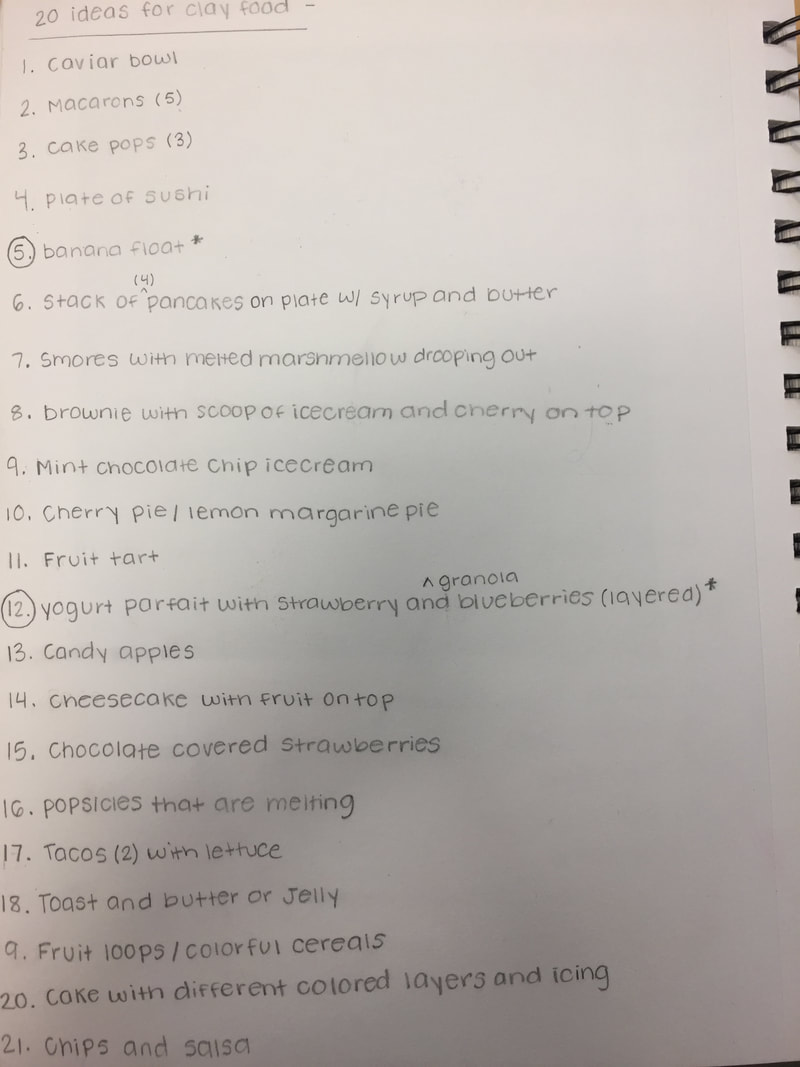
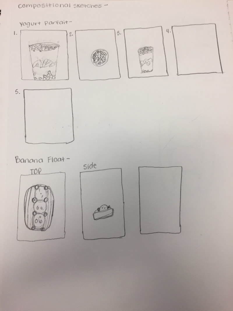
Pen and ink project ideas and compositional sketches-
- These are the 20 ideas I came up with for the final pen and ink project and the compositional sketches
|
|
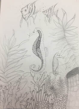
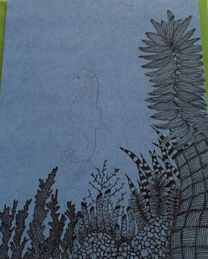
Pen and ink in progress pictures-
|
|
pen and ink final-
1. Describe how you arranged your composition. Discuss your use of the elements and principles. Is it a successful composition?
I spread out everything that were in the same reference photo and changed it up a bit, so i wouldn't be copying everything in the picture. I do think this was an successful composition.
2. How is texture and patterns important in your composition?
Texture was really important in my composition because I wanted people to be able to imagine what certain things in my composition would feel like. Having patterns in my final was also important because it made everything stand out so much more than it would without any patterns.
3. Why is value so important in this project?
Value was important in this project because I did a lot of layering on the bottom half, therefore in order to make that more obvious adding shades and highlights really put the piece together.
4. Describe your craftsmanship?
I do think i could've made this project look a lot better in the end. I took a long time for this project but most of the time when I worked on it I was rushing.
5.
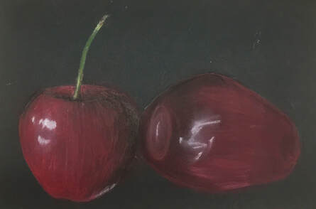
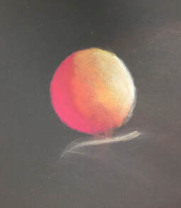
pastel fruit and practice-
|
|
prisma colors fruit and practice-
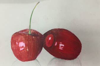
|
|
watercolor fruit and practice-
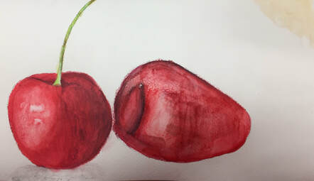
|
|
---------------------------------------------------------------------------------
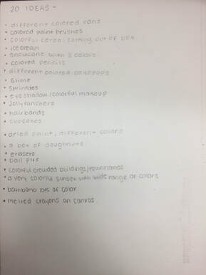
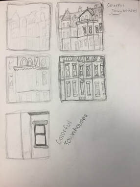
20 ideas- Compositional sketches-
|
|
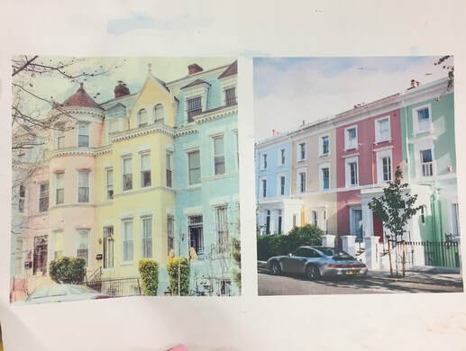
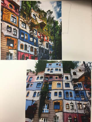
Reference photos-
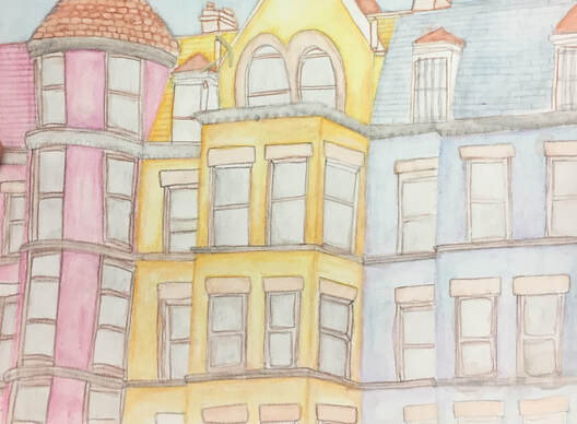
Final-
Self evaluation-
- Describe the overall composition of your artwork (balance, unity, rhythm, and movement).
2. How did you use value to create dimension? Is this important? Why?
I used shadows when one part of the building came out further than the other to create depth. I added highlights in the windows to create a glare and on parts of the building the sun hit more. Using value was important in this project because if I didn't the building would've looked flat.
3. What did you achieve by using exaggerated color?
Using more color makes the piece look more full of life, and less dull. I think if I wasn't to use color showing the different values would've been harder.
4. Describe the craftsmanship of your colored pencil/chalk pastel. (How good the project is technically crafted).
I actually used watercolor instead and making this project took a long time, especially having to wait for certain layers to dry. To get a darker color or shadow i had to paint more layers until it was dark enough.
5. Were you able to achieve depth by showing foreground, middle ground, and back-ground? Explain?
My project didn't have a foreground, and the back-ground was very little and it was just the sky, so I wasn't able to show depth in that way. Instead I showed depth on the outside of the building by adding highlights and shadows.
6. Explain your experience with colored pencil/chalk pastel. What were the obstacles and advantages?
Using watercolor was really fun, it was also my first time working with watercolor and using it for one of my final projects. Watercolor does take a lot of patience but in the end its all worth it.
--------------------------------------------------------------------------------------------------------------------------------------------------------------
20 ideas-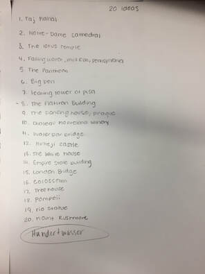
Reference photos- |
Compositional sketches-
|
Final- |
|

Self evaluation-
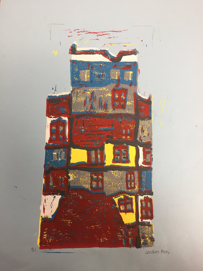
1. Describe the craftsmanship of your prints.
- registration and carving: Carving was the best part of this project for me. I was more careful when carving than i was when i laid the prints down.
- Brushing and ink printing: This part was really sloppy, I went really fast when i painted.
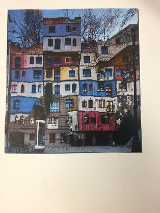
2. How did you use texture, color harmony, and balance to define your choice of subject?
The building is originally very colorful and rough looking, so i used multiple colors to show the uniqueness of the building. In some parts the walls of the building looked very rough, kind of like the texture of cement, so i used less ink in those areas to give it the same texture.
3. If you could recreate your pieces, what would you do differently to enhance your final outcome?
I would be a lot more careful while printing the different layers to make it look neater. i'd also make the colors look more similar than the actually colors on the building.
- registration and carving: Carving was the best part of this project for me. I was more careful when carving than i was when i laid the prints down.
- Brushing and ink printing: This part was really sloppy, I went really fast when i painted.
2. How did you use texture, color harmony, and balance to define your choice of subject?
The building is originally very colorful and rough looking, so i used multiple colors to show the uniqueness of the building. In some parts the walls of the building looked very rough, kind of like the texture of cement, so i used less ink in those areas to give it the same texture.
3. If you could recreate your pieces, what would you do differently to enhance your final outcome?
I would be a lot more careful while printing the different layers to make it look neater. i'd also make the colors look more similar than the actually colors on the building.
---------------------------------------------------------------------------------
20 ideas- Compositional sketches-
|
|
|
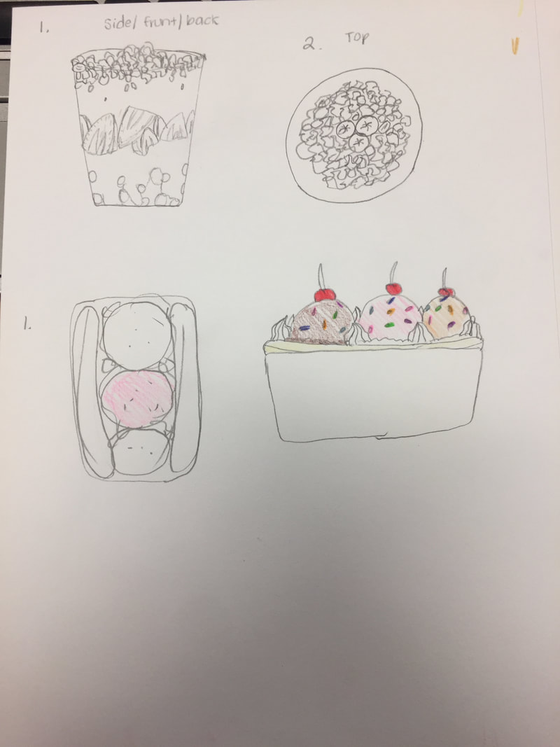
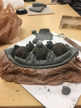
In progress-
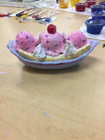
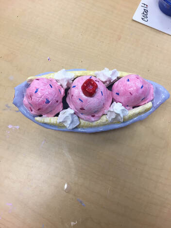
Final-
|
|
Self evaluation-
1. Describe the craftsmanship in your sculpture.
For the most part my sculpture is neat and well executed. i tried my hardest to match the texture of the clay food with the real life food to make it look as realistic as possible.
2. What was the most difficult part of this project?
The most difficult part of this project was probably trying to get the right texture of the ice cream. i went through three different methods, for example, using a paper towel, and coffee grounds, but only one worked out in the very end.
3. Did your color choices work together harmoniously?
I think they do, the colors aren't really supposed to match but when i was done painting, the colors made it even easier to tell what my sculpture was.
4. Is your sculpture interesting from all views?
Since i made a banana split, the sculpture was very busy and had something anyway you looked at it. From the sides you are able to tell what it is easier, but from the top not so much.
5. Describe the differences in constructing a sculpture and doing something 2D?
When constructing a sculpture you are able to see from all angles, while doing something 2D you are able to see one or two angles of the object.
6. How did you create textures in your sculpture?
I didn't just use the clay tools provided to us, but i used other items from home to help create different textures, for my icecream i used coffee grounds to give it the rough texture it gets when you scoop it out, and for the bananas i used the needle tool to create the cracks and lines that are on the fruit itself.
7. Does your sculpture look like the actual food? How did you accomplish this?
Yes, my sculpture does look like the actual food. I accomplished that by making sure i used the right colors and textures the real food has so that it would look as realistic as possible.
8. What would you do differently if you were to do this project again?
I would make sure that i hollowed out everything that needed to be before actually placing all the clay food together, because i had to take apart my sculpture because i forgot to hollow out the scoops of icecream.
---------------------------------------------------------------------------------
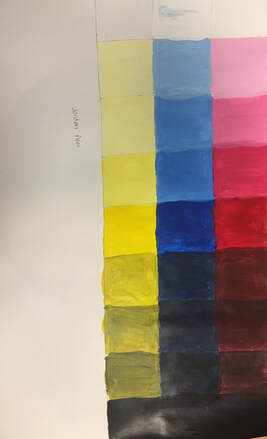
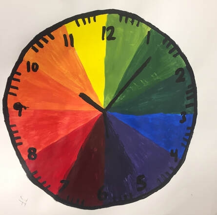
value chart- Color wheel-
|
|
